Why I’d Rather Have Bradley Beal On The Celtics Than Damian Lillard

With the Boston Celtics being eliminated in the first round by the Brooklyn Nets this postseason, it’s clear that changes must be made in Beantown. Damian Lillard and Bradley Beal are two names swirling around the NBA parts of the Twitterverse as potential targets for the Celtics. Those two players would be acquired very differently and would lead to very different situations in Boston. This article will delve into my reasoning as to why I’d rather have Beal on the Celtics than Lillard. So, without further ado, let’s get into it!

Reason 1: Jayson Tatum and Bradley Beal are friends

Bradley Beal and Jayson Tatum have been friends for over a decade. They met when a 6 (ish) year-old Beal was babysitting a toddler-aged Tatum. Beal’s mother and Tatum’s mother were great friends, which opened up a friendship for the two sons. Growing up in St. Louis together, Tatum and Beal attended high school together and played basketball together growing up. Their old trainer, Drew Hanlen, speaks very fondly of the relationship between Tatum and Beal since they were teenagers. Throughout each of their tenure’s in the NBA, they’ve maintained a close comradery despite always being on different teams. When asked, both Beal and Tatum have raved about the idea of them being able to team up. This past All-Star Break, they finally got that chance. Sort of. They were able to play together on team Kevin Durant, but I suspect that they are interested in a longer-term union. They’ll be playing with each other this summer in the Olympics for Team USA, which is known for creating relationships. DeAndre Jordan, Kevin Durant, and Kyrie Irving plotted their team-up in Brooklyn during their stint on Team USA together, so it makes sense that something like that can happen (if it hasn’t been in the works already).

— — —

Reason 2: Bradley Beal is easier to acquire than Damian Lillard

While Damian Lillard is rumored to be unhappy in Portland and could be available by trade, the asking price for him would be immense. Lillard is a better player than Beal, and therefore more difficult to acquire via trade. (I’ll go through my mock trade ideas later in the article) Mock trades in which the Celtics trade for Lillard would include the Celtics parting with a combination of valuable assets including (some, not all of) Jaylen Brown, Marcus Smart, Robert Williams III, Payton Pritchard, and Aaron Nesmith, along with a massive slew of draft picks. Mock trades in which the Celtics trade for Beal involve the Celtics sending out a vast amount of different packages, but none of them require Boston to completely blow up their core in order to complete the trade. Beal also becomes an unrestricted free agent in the 2022 offseason, the same offseason in which the Celtics have a max slot available for someone just like Beal. If the Celtics wait a season, they could get Beal without having to sacrifice any assets at all! Some people point out that waiting to sign Beal is not as smart as trading for Lillard immediately, but I think keeping their core together and retaining depth while waiting a season for Beal is the better choice. I’d rather have Jayson Tatum, Jaylen Brown, Bradley Beal, Marcus Smart, and Robert Williams III than Jayson Tatum and Damian Lillard.

— — —

Reason 3: Damian Lillard’s contract

Right now, Damian Lillard’s contract is pretty fair given his insanely high level of production. But, his contract on the Celtics doesn’t make sense given Boston’s timeline. Tim Bontemps on Twitter, the year that Jayson Tatum decides his future with the Celtics after his current contract extension runs out is the same year that Damian Lillard will be 34 years old and making $50 million a year. That’s not a good financial situation to be in. Tatum needs to be at the forefront of the team, and Lillard’s contract will most likely be widely regarded as one of the worst in the league. Lillard right now is an excellent player, but for the future of this Celtics team, Bradley Beal makes more financial sense.

— — —

Reason 4: It’s supposed to be a big 3, not a big 2!

Jayson Tatum is obviously the cornerstone of this Celtics franchise, as he’s nearly a top 10 player in the NBA. Being paired with Jaylen Brown elevates not only Tatum’s performance but Brown’s too, so breaking them up to acquire Damian Lillard or Bradley Beal wouldn’t make as much sense as just waiting until the 2022 offseason to sign Beal with the max slot that Boston will have. The point of signing Bradley Beal is to form a big 3 in Boston, but trading Brown for Beal (or Lillard) would defeat the purpose of acquiring a 3rd star. My ideal scenario would be if Boston signed Beal next offseason, retaining Brown and Tatum.

— — —

My ideal move for the Celtics

With many possible routes that lead to Beal in Boston, I have a couple of my best-case scenarios to get Beal on the Celtics.

Move #1 (my first choice): Celtics sign Bradley Beal in the 2022 NBA Offseason.

This path is really straightforward. Boston will have a max slot to sign a high-caliber free agent in the 2022 offseason if they choose to do so. If they do intend on exercising that slot (which they most definitely will), one of the best candidates available (that would realistically sign with the Celtics) at that time will be Beal. With players like Kevin Durant, Kawhi Leonard, Stephen Curry, Kyrie Irving, James Harden, and Jimmy Butler potentially hitting the open market, Beal is a guy who can fly under team’s radars and be signed by the Celtics.

Move #2 (my second choice): Celtics trade for Bradley Beal.

If I were Boston’s President of Basketball Operations Brad Stevens, my trade package for Beal would look something like this:

Washington Wizards receive: Al Horford, Romeo Langford, Moses Brown, 2023 first-round pick, 2025 first-round pick, 2027 first-round pick, 2022 second-round pick (all FRP’s via Boston), 2022 second-round pick (via Charlotte).

Boston Celtics receive: Bradley Beal.

This is a mock trade that I’ve workshopped for some time now. The Wizards aren’t going to be a contending team anytime soon, so they are looking for young players and lots of draft picks. This trade incorporates both of those things. Romeo Langford and Moses Brown are two promising young pieces to aid Washington in their rebuild. But the real gold mine in this deal is the 3 first-round draft picks over the next 6 seasons that Washington receives, including two second-round selections in 2022, all unprotected. And for Al Horford, he’s thrown in the deal for salary matching purposes.

For Boston, this deal is a home run. They form their big 3 and solidify their core. And the best part is, they don’t have to part with Jaylen Brown.

Move #3 (my third choice): Celtics trade for Damian Lillard.

Portland Trail Blazers receive: Jaylen Brown, Robert Williams III, Romeo Langford, Aaron Nesmith, 2023 first-round pick, 2025 first-round pick, 2027 first-round pick (all FRP’s via Boston), 2022 second-round pick (via Charlotte), 2023 second-round pick (via Oklahoma City).

Boston Celtics receive: Damian Lillard.

In this trade, the Trail Blazers fully commit to a rebuild and give Damian Lillard a better chance to win a championship. They receive tons of young talent, with all-star Jaylen Brown and rising force Robert Williams III headlining Portland’s haul. They also receive a massive slew of first-round picks, and a couple of second-rounders as the metaphorical cherry on top. With this trade, Portland would probably deal C.J. McCollum as well since one doesn't really make sense without the other, but that’s a discussion for another post.

While this is not my ideal scenario for the Celtics, it’s not like it’s a bad one. Lillard is a marvelous talent, and fills a big hole at point guard for Boston. He’s a superstar in this league, but the problem here for Boston is that they part with Jaylen Brown and Robert Williams III. Boston would lose this trade, seeing as they’d decrease their depth and sacrifice a wonderful fit between Brown and Jayson Tatum.

— — —

All in all, neither of these situations would be particularly bad for the Celtics. I might be arguing for what would be considered the unpopular opinion in this scenario, but I feel as though Bradley Beal would be a better fit for Boston, while also being easier to acquire.

Using Play-by-Play Data to Examine Volume and Shot Difficulty in the NBA

There are two main aspects to shooting and scoring in the NBA: volume and efficiency. The balance of the two is an interesting topic for debate, and it's hard to evaluate a scorer without both. But is volume really necessary? Once you cross a qualifying mark and eliminate the majority of sample size issues, can efficiency be the sole determiner? One of the reasons the answer is a relatively firm "no" is that the two should be inversely correlated. Scorers who have a larger portion of a team's offensive load should have to take more difficult shots more often, dragging down their overall efficiency. So, what happens if we put it to the test using play-by-play data?

Introduction

Unfortunately, there are a few issues that make testing this philosophy difficult. The first is that better shooters are likely given more volume by their coaches. This presents a survivorship bias of sorts. The second is that player-tracking data about defender distance that would be very valuable to answer this question isn't publicly available. The second problem doesn't have a real solution, so instead, I'll be using shot distance. Because of large differences in playstyle that would confuddle the data, I'll only be using three-point stats. As a Blazers fan, I've seen Damian Lillard launch many a thirty-footer because that's where the open shots are for him. But does this hold as a statistical trend?

The first problem results in a cleaner but more complicated solution. Essentially, the plan is to find the difficulty of a shot at each distance by looking at how players shoot there compare to their average shot. Then, I'd take this data and use it to determine the average difficulty of each NBA's players shots. Finally, I'd graph it with volume to see if a trend emerged. It's a bit complicated, so I'll explain with a simple example using two players from two shot distances. Capital M will represent a make, and lowercase m a miss.

Player A (7 shots): 25M, 25m, 25m, 25m, 25m, 25m, 35m

Player B (11 shots): 25M, 25M, 25M, 25m, 25m, 25m, 35M, 35M, 35m, 35m, 35m

As I mentioned above, we can't simply take the percentage from each distance. This is a problem because of something known as Simpson's paradox. It deals with how groups of data can interact with the data as a whole. In this example, taking the raw 3P% would show that shooting from 25 feet (4/12) and 35 feet (2/6) is equally efficient. Both player A and player B, though, individually shoot better from the shorter distance. How is this possible? Well, because the more efficient shooter (B) is shooting the longer shots at a higher rate, it skews the data. To solve this, we need to compare each shots' percentage (always either 100% or 0%) to the expected rate (the player's overall 3P%). 

Player A (7 shots, 14.3%): 25 (+85.7), 25 (-14.3), 25 (-14.3), 25 (-14.3), 25 (-14.3), 25 (-14.3), 35 (-14.3)

Player B (11 shots, 45.5%): 25 (+54.5), 25 (+54.5), 25 (+54.5), 25 (-44.5), 25 (-44.5), 25 (-44.5), 35 (+54.5), 35 (+54.5), 35 (-44.5), 35 (-44.5), 35 (-44.5)

Then, we need to take the average conversion rate over expected from each distance:

25 feet: +3.683%

35 feet: -6.467%

After that, we can find the average difficulty of each player's shots:

Player A: +2.233%

Player B: -0.930%

We can then stick these points on a graph, and we have our answer! For this example, there is a perfect negative correlation between volume and shot difficulty.

froala_undefined_1623514064589-1623514064589.png

Obviously, it was going to be much more difficult on a larger scale. The most efficient path would likely require some coding. However, because I don't know any coding languages, I decided to work in Excel and learn as I went along if I didn't know the particular formula I needed. This is the end result of a lot of trial and error. It wasn't as easy as it sounds, nor was my process as clean as it is written. If you aren't interested in the specifics, there will be a TL;DR at the end of the section. 

The Process

The first step was to download the play-by-play data. This would not have been possible without coders writing open-source scripts that they use to "scrape" data from various sites. I used play-by-play data released by the user schmadamco on Kaggle. The data is directly from Basketball-Reference, and I used the latest complete season (2019-20). Of course, it wasn't in the exact format I needed. There were no functions that directly showed whether or not a shot was a three-pointer, and the function for makes/misses was still in a text format, which isn't very good to work with. The solution to both issues was simple, as I could simply write a function asking Excel to check a cell and see if its contents were "3-pt jump shot," for the first and "make" for the second. If so, it would return the number one and, if not, zero.

Next, I sorted the sheet based on whether or not the value for a three-pointer was one. I copied out all of the three-pointers and the values for who the shooter was and whether the shot was made. At this point, I would need to know the three-point percentage of each player. Instead of having to manually plug this data in another way, though, I could thankfully use a feature of Excel known as a pivot table to get the work done for me. Pivot tables allow you to organize data based on other data. For this, I needed for it to take the average of the "make" value for each player. Because all makes are shown as a one and all misses a zero, this formulates their 3-point percentage.

froala_undefined_1623518134977-1623518134977.png

Even with the three-point percentages, though, it would still be a lot of work to manually plug in the value to every shot. Thankfully, there is an Excel command that takes a cell, references a table, and finds an identical cell in the left-most column of that table. Then, it takes the value from the same row of a column that you select. Doing this, I could add a three-point percentage value for every shot based on the player who took it. Here is a small slice of the data I now had:

froala_undefined_1623518969844-1623518969844.png

Next, like the example, I compared the make value to the 3P% of that player. This would form 3-point Percentage Over Expected or 3POE. As in the example, it will either be one or zero minus the player's 3P% so it looks weird, but it averages out nicely in the long run. After finding the 3POE for every shot, I used another pivot chart to take the averages by distance (I also adjusted every distance above 47 feet or half-court down to 47 to help with sample size issues). Then, I smoothed it by taking the mean of the scores for each distance and the two distances directly bordering it. Visualized in this chart are both the raw and smoothed values:

froala_undefined_1623523315962-1623523315962.png

It definitely makes intuitive sense, which is great. Shots get progressively more difficult as players move away from the basket until a steep drop-off when players go from true shots to what is likely primarily heaves. Because these shots prioritize luck to skill, the percentages plateau. While this range is noisy even in the smoothed version, I decided to leave it as-is because these shots shouldn't be statistically significant in moving a player's degree of difficulty, apart from super small sample sizes.

After that, I had to link the smoothed difficulty to the distances on a shot-by-shot level. To do this, I repeated the same process I used to link the 3P% to each player. I used the exact same formula in the exact same way, and it ended up giving the difficulty for every distance, which would be used in the next step to determine the overall difficulty of a particular players' shots. Here is a slice of what that looked like:

froala_undefined_1623524088016-1623524088016.png

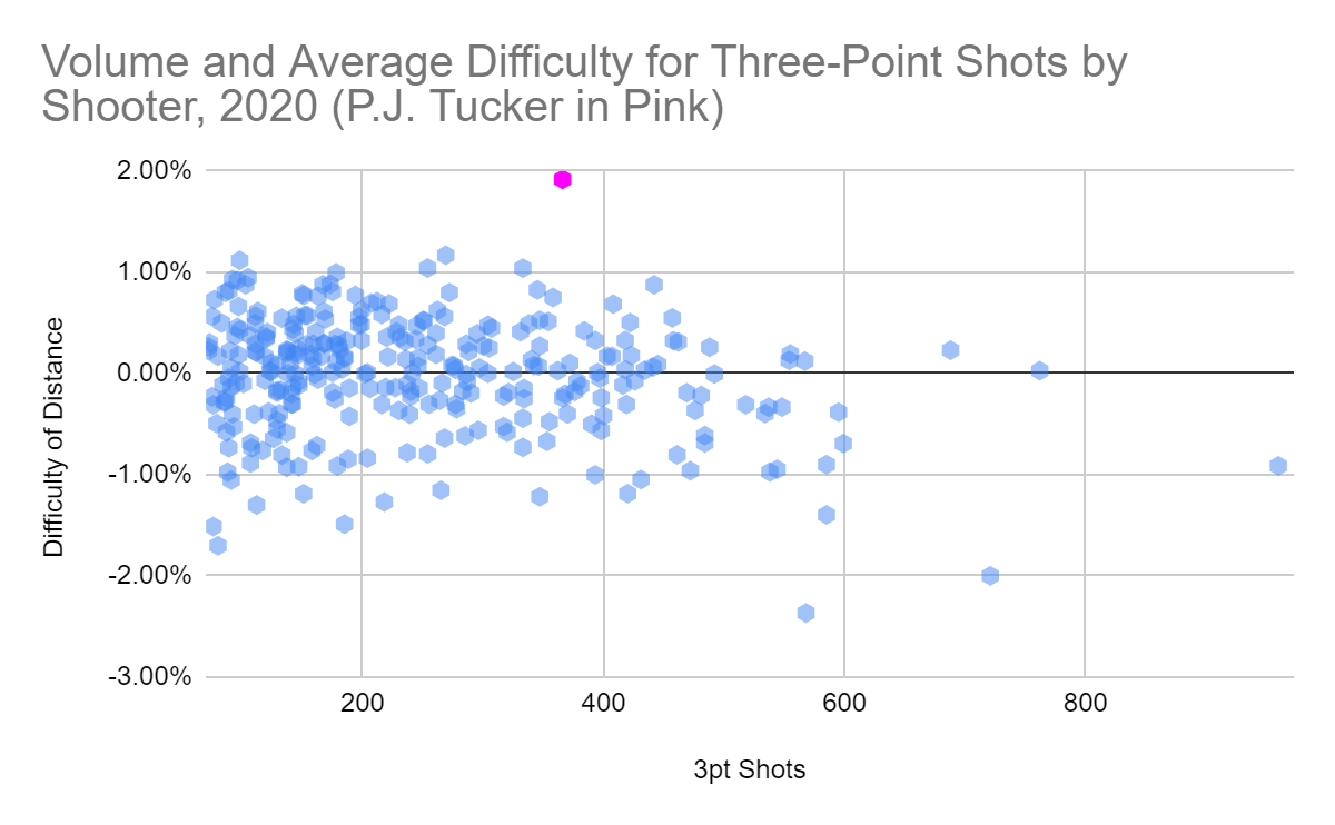
I was now just one pivot table away from being able to graph the final result. All I did was chart the average difficulty by the player along with their volume of shots. It was now time to graph the final result. Because I am more comfortable with the interface and slightly prefer how the graphs look, especially scatter plots with a bunch of points, I copied the data over to Google Sheets. First I graphed every player and their average shot difficulty, before eliminating players who took less than 72 threes (one per game for the median team) so that the data could be more easily understood. Here are both charts:

froala_undefined_1623524507918-1623524507918.png
froala_undefined_1623524539244-1623524539244.png

TL:DR: I downloaded play-by-play data then formatted it so it was usable. Then I got rid of all the data points that weren't attempted threes and used a feature of Excel to calculate every player's 3P%. After that, I added a 3P% for every shot based on the player who took it and compared the actually shooting percentage (either 100% or 0%) to that. I took the average of what I just calculated for each distance to decide the difficulty of a shot from there. Then, I calculated the average shot difficulty by player and used it to make the charts you can see above.

Results

I was really happy with how this turned out. You can see that there is an imperfect but clear trend towards more difficult shots for high-volume shooters, proving my hypothesis. 59.5% of players who shoot less than 200 threes have an average shot difficulty higher than zero (easier than average); this number drops to 53.3% for those shooting 201-400, and all the way to 42.6 for players who shot more than 400 threes in 2020. Overall, more than 55% of players shot easier than average. This may not make sense, but it's similar to the difference between medians and means: the averages are different when averaging players than averaging shots because much of the shooting load is handled by a select few. 

The data also supports the consensus about certain players around the league. For example, the two qualifiers shooting the most difficult shots were Trae Young (-2.37%) and Damian Lillard (-2.00%). They both love to launch deep threes and highlight a general trend visible in the data. Players that are the focal points of their offenses are likely to have a higher difficulty rating, regardless of how many shots they take (at least among those who already have a high shot volume). By manually searching the USG% in 2020 of players who took at least 500 threes that year, we can build this chart:

froala_undefined_1623528362482-1623528362482.png

Even without using defender distance, which would probably show the trend even better, we can see that there is an obvious connection between load and shot difficulty. The more of an offensive load a player handles, the harder, on average, their shots are. This is unlikely to hold for players that don't take a ton of threes, as their gravity would focus almost entirely on defender distance. Intuitively, this trend makes sense for high-volume shooters, who often fall into two categories. There are the Damian Lillards of the NBA who have offenses revolving around getting them open anywhere downtown. Then, there are players like Duncan Robinson who shoot a ton of efficient shots because they benefit from the gravity of the true stars in their offense.

There are two lower-volume outliers that stand out because of how far they are from everyone else. The first is Montrezl Harrell. Of the twelve players that took more difficult threes on average than Trae Young, eleven of them took ten shots or fewer. Harrell, though, took twenty-three and still finished fifth among those twelve. Of Harrell's shots, though, ten (43.5%) were from 40+ feet. Damian Lillard, who is not only known for launching deep threes but also took more than thirty times as many shots as Harrell, took just five. You have to respect players who are willing to let it fly from deep when their team would benefit from it.

On the exact opposite end of the spectrum is P.J. Tucker. This isn't exactly surprising, as Tucker is known to be a corner-three specialist. But just how much he stands out is still kind of crazy. Because of how it's constructed, the maximum possible 3POE is 3.1%. By going one foot farther from the basket that changes to 2.6%. If you are just two feet behind the line in the corner (equivalent to being right behind the line anywhere else), you would end up with an average shot difficulty of +1.89. Tucker's is +1.92. That takes serious scheming and is a great example of the extremities of the Morey-era Rockets.

froala_undefined_1623529737488-1623529737488.png

One final thing I wanted to do was adjust the 3P% of all of these players based on their 3POE. What 3POE essentially measures is how much above or below average any given player might shoot if they took the same shots. It isn't perfect, but by subtracting a player's 3POE from their actual 3P%, we can roughly adjust for difficulty and get an idea of what a player might shoot with a perfectly average range of shots. Subtraction is used because negative scores mean harder shots and therefore those players should be given a boost. Of course, this is far from an objective ranking of the best three-point shooters, but I think it might be a slightly better indicator than normal 3P%.

froala_undefined_1623544369003-1623544369003.png

All things considered, it's a relatively minor adjustment. There is little deviation from the real 3P% to the adjusted 3P%, and this is once again primarily because I'm only considering shot distance. Players shooting this many threes are unlikely to deviate too far from an average distance. However, players on the extreme ends see some relatively major re-calculations. Trae Young goes from a below-average shooter (40th percentile) to a good one (66th). Damian Lillard goes from great (83rd) to elite (94th). P.J. Tucker sinks to a flat-out bad shooter (18th) when the unadjusted version thinks he's alright (38th). In total, 54 of 167 players see their percentile adjusted by at least five points. The rest stay about in the same place.

None of this is definitive, and it didn't make me wildly reconsider how the NBA works. However, I think it was an interesting look at both answering my original question and applying raw data to elegantly solve a problem. There was a clear trend in the direction I thought there would be, which is always nice, and it supported other basic intuitive ideas that I and others have about the NBA. It was definitely cool to go from a long incomprehensible list of plays to interesting charts that let me visualize certain trends. Overall, this was a great experience and something I may try again with a different problem.

The Past, Present, and Future of NFL Statistics

Baseball seems to be far ahead with its analytical revolutions, and that gives us an idea of what the NFL's might look like. We can see changes in efficiency measures that mirror those already happening in the NFL and NBA. One great example is the shift from batting average (BA) to on-base plus slugging (OPS) to weighted-on base average (wOBA). In the NBA, we've seen shooting efficiency adapt over the years, moving from field goal percentage (FG%) to effective field goal percentage (eFG%) and finally to a points-per-possession-based approach in true shooting percentage (TS%).

The NFL, too, is getting there. For overall quarterback efficiency, there are three statistics in similar places to those above. Passer rating is the basic statistic that's been used for a good while, QBR the newer statistic that still presents major flaws, and EPA/CPOE composite the newest and most advanced look at efficiency (more on all three of those below). However, for what fans use, the NFL lags behind. Passer rating still holds the most weight in debates with QBR looked at by some as the be-all-end-all and others as worthless. As for EPA/CPOE composite? Most NFL fans haven't even heard of it.

For those reasons, I thought it would be interesting to look at the past, present, and future of metrics in the NFL. I sorted a variety of them into four groups. The first is the "past." These are basic statistics that I believe will be phased out of conversations about player value. Then there is the "present (I)." These statistics are a bit better and may have certain uses down the road. They are more advanced but still fall short. Third is the "present (II)." These metrics are currently available and some of the most useful at that. Modified and unmodified versions of them will be a part of analytics for a long time. Finally, I take a look at the "future," unreleased or undeveloped metrics that may be very useful in the near future. Obviously, this is not holistic. I am only reviewing a few statistics in each category.

The Past

Seymour Siwoff, one of the primary contributors to passer rating (via The New York Times)

Seymour Siwoff, one of the primary contributors to passer rating (via The New York Times)

Passer Rating

Like most metrics, even the outdated ones, passer rating was ahead of its time. It was an easy way to compare quarterbacks seasons by combining four measures of efficiency that were valued very highly at the time: completion percentage, yards per attempt, touchdown rate, and interception rate. However, due to the lack of existing research, the weights are all wrong. Completion percentage really shouldn't be a part of the formula given that it involves yards per attempt, not completion. This double-counting allows quarterbacks to benefit from passes that gain no yards over an incomplete pass.

The balance between yards, touchdowns, and interceptions is also a bit of a mess. Modern research based on the point worth of each down and yard of the field values a touchdown as being worth roughly twenty yards and an interception as negative forty-five. However, passer rating values a touchdown at eighty yards and an interception at negative one hundred. This is so far off that passer rating is borderline useless. However, the formula has given a rise to better versions of passer rating that are also easier to calculate and conceptualize.

Rushing Yards

Recently, there has been a variety of research that conflicts with conventional thinking. Sacks once thought to revolve around the battle between offensive and defensive linemen are seemingly caused more by the quarterback and defensive coverage. The same is true of rush yards. The idea of running back replaceability centers around two things: the value of the run game and the role of the running back in it. The first is a whole post in and of itself, but the second reveals one of the main flaws with rush yards. Rush yards (as well as the per attempt version) doesn't even try to differentiate between yards created by the offense and the defense.

While I'm using the volume versions for all of the running back statistics, this one has the flaw of being the most attempt-focused. While the other two (YAC and RYOE) have some sort of replacement level adjustment, even if they aren't phrased as such, rush yards give an automatic 2-3 yard boost per carry before the running back even needs to deal with contact. In the end, rush yards are a simple and logical counting statistic. However, they aren't really useful to determine running backs from one another, even on a relatively basic level.

The Present (I)

Approximate Value (AV)

Doug Drinen, founder of Pro-Football-Reference and creator of Approximate Value (via Sewanee: The University of the South)

Doug Drinen, founder of Pro-Football-Reference and creator of Approximate Value (via Sewanee: The University of the South)

The best currently available positionless and volume-dependent impact metric is approximate value or AV. There are a large variety of flaws with AV, however. It struggles to separate the pieces of the puzzles that are NFL offenses and defenses. For example, it can't really differentiate between the performance of an offensive line and that of the rest of the offense. Doug Drinen, its creator, phrases it as an improvement over conventional assessments of a career like starts or Pro Bowls. It tries to bridge that gap by valuing each season with playing time but giving better seasons higher values. And more than any imperfections in the formula, this is where the flaw lies. It isn't even an impact metric.

It doesn't deal in points or wins, meaning it is much harder to conceptualize and understand, It's entirely situational, starting with a base of points based on the strength of a team's offense or defense then dividing them out. It doesn't value positions correctly (although it tries to), a huge issue in the NFL. For example, AV thinks the best player from the 2017 draft is not Patrick Mahomes but rather Ryan Ramzcyk. It gets even worse when you look at the methodology. It ranks positions in value based on the draft capital spent on them and how it is valued in the Jimmy Johnson draft chart. Then, it kind of just throws around more numbers until it seems to look right.

There are some good things about AV. It certainly beats using Pro Bowls and seasons started when building a draft chart. It also gives a vague understanding of value for players that are hard to value. A couple of quotes from Drinen really help us understand what AV is really trying to do:

"The main goal of this thing is to generate numbers that match perception."

"If one player is a 16 and another is a 14, we can't be very confident that the 16AV player actually had a better season than the 14AV player. But I am pretty confident that the collection of all players with 16AV played better, as an entire group, than the collection of all players with 14AV."

So, considered as an impact metric, it perhaps belongs in the "past" group. It might have ended up there if not for the lack of others that worked across positions. However, it's pretty good at doing what it is trying to and can give us a loose grasp of player value.

Adjusted Net Yards Per Attempt (ANY/A)

Although it looks completely different on a list, ANY/A is what passer rating was trying to be. However, there are a large of improvements that it has over the original. It gets rid of the useless and arbitrary inclusion of completion percentage. It eliminates the floor and ceiling of each statistic, largely for simplicity's sake. While there is also a version that doesn't do this, it includes sacks in the yards per attempt number, a positive adjustment according to research that finds sacks are a quarterback statistic. It also fixes the overvaluation of touchdowns and interceptions that I talked about above, using those numbers of twenty and forty-five.

Where ANY/A falls short is separating the contributions of a quarterback from the rest of the passing offense. There are no adjustments for easily countable factors like drops and yards after the catch. Even those would likely be insufficient, however. YAC can easily be influenced by the quarterback himself, and there is more to determining accuracy than adjusting for drops. ANY/A also treats every yard and touchdown the same, with no garbage time adjustments. Overall, this is a solid stat and a step up from passer rating, but it still falls short in a lot of places.

Run/Yards After Contact (RAC, sometimes written YAC)

This is the easiest and simplest way to separate the contribution of a running back and his offensive line. However, it relies on a faulty assumption: Yards before contact are created by the line and scheme, while yards after contact by the running back. If this were to be true, RAC would be an amazing statistic. First of all, it helps to add a replacement level distinction. If any running back could get a few free yards per carry behind a particular offensive line, why even reward him for those yards on his carries? This makes it so efficiency is rewarded a bit more. It also attempts to even the playing field by erasing the differences in lines. However, all this leads to more problems.

The biggest issue is that not all contact is created equal. For example, a running back could evade a weak tackle at the line, then turn the play into a fifteen-yard gain because his offensive line created so much space. A different running back might get outside and avoid contact for a five-yard gain before stepping out of bounds facing three defenders in front of him. RAC has a bias towards these types of breakaways in particular. It just doesn't hold that yards before contact is entirely about the line and yards afterward are the responsibility of the running back. RAC also has a volume bias. While it isn't as significant as normal yards, the volume bias still isn't the best.

The Present (II)

PFF Grades

Pro Football Focus, or PFF, is maybe the most controversial organization in football. Any time one of their writers has a view that differs from traditional norms, the entire organization is mocked. Bring up a PFF grade in a conversation at your own risk; someone is likely to let you know that you need to watch the games. That's a bit ironic considering that the point of PFF is to watch every single play, grading it based on a players' performance and the importance of the play. The main issue with PFF grades is that they are inherently subjective. Two different people, even if both are experts, could come to completely different conclusions about the same play.

But subjective does not mean useless. Grades can be a great starting point when comparing two player-seasons and are a lot better than approximate value in that context. Larger issues for me than the subjectivity is that the grades are rate statistics, which isn't ideal in many contexts for this kind of impact metric, and that they don't go back much farther than a decade. A bit more transparency on the whole process from PFF would also help, as would the availability and accessibility of grades without a paywall. PFF grades are great as a starting point. However, like AV, they don't do too much to actually show player impact.

The best playoff quarterbacks of the century, plotted by EPA and CPOE (plotted on rbsdm.com)

The best playoff quarterbacks of the century, plotted by EPA and CPOE (plotted on rbsdm.com)

EPA/CPOE composite

To my knowledge, EPA/CPOE composite is the best available quarterback performance metric. It combines two pieces of data, each with a different purpose. EPA, or expected points added, is like a much improved ANY/A. It takes scrambles, penalties, and sacks into account. Instead of using yards, touchdowns, and interceptions as its base, it uses expected points based on down, distance, and field position calculated before and after a play. Touchdowns and interceptions are weighted based on how bad those particular plays are instead of a non-situational number.

The second bit is CPOE or completion percentage over expected. While I hate completion percentage itself as a statistic because it promotes easy passes, CPOE uses the separation of a wide receiver, the space the quarterback has to throw, and the location of the receiver to develop an expected completion percentage. Then, this is compared to a quarterbacks actual completion percentage. This gives a very good idea of accuracy as well as simply how much is contributed by the quarterback versus his receivers, his line, and the scheme.

Each of these statistics has its shortcomings. EPA is great for determining the value of a play but does nothing to determine responsibility. CPOE only considers passes and weighs passes in a way that is out of line with their actual value. It's a flaw that will always be there when starting with something as disconnected from true impact as completion percentage. They work like bread and butter, though. Finding a balance allows room to correctly value different plays while also considering the quarterback's role in them. It isn't perfect, but it sure beats passer rating.

Rush Yards Over Expected (RYOE)

The basis for Next Gen Stats is simple but genius. It's amazing how much data can be gathered from tracking just the location of each player on the field. Some of the resulting statistics are very simple, such as separation. All this shows is the distance between a receiver and closest defender. However, by combining the location as well as the speed (which can easily be determined) of players and machine learning, NGS has been able to develop a variety of "expected" metrics like the one that is the base for CPOE.

One of them deals with rushing yards. This is the closest we've gotten to being able to differentiate between the contributions of a running back and the other factors which make the run game work. RYOE isn't perfect, and it doesn't necessarily deal with running back value, but rather a better look at running back yardage. It also has a helpful per-carry version, as with both of the earlier running back statistics. Overall, RYOE can give a solid look at a running back's contribution to the offense he plays in, or at least the running game. 

The Future

PFF WAR

I wish with all of my heart that I didn't have to put PFF WAR in the future section. Unlike the next metric, which is just an idea, PFF WAR is a fully developed metric that can be and has been calculated for every player-season since PFF has tracked and graded players. Unfortunately, PFF has been very reluctant to roll out the metric for the public. Even with an elite subscription costing $200 a year, one could only see the PFF WAR for top players entering free agency. I really wish that PFF would release the numbers, potentially for free, because it would be a monumental step forward for football analytics.

Eric Eager, the man who developed PFF WAR (via Linda Hall Library)

Eric Eager, the man who developed PFF WAR (via Linda Hall Library)

PFF WAR is a really elegant solution to the issue with NFL impact metrics. With baseball, players often act alone, making it easier to isolate their contributions to a team. In hockey and basketball, even top players go to the bench to rest for long periods of time. With football, on-off metrics are very unstable because of the lack of sample size and because players are often on or off the field for specific schematic reasons. PFF WAR's solution is to artificially take a player off the field on every snap they played, replacing them with an average player using PFF data. For a receiver, a drop might turn into a catch with an average player, or vice-versa, hurting or helping his grade. This is adjusted to replacement level later.

PFF WAR is not only intuitive, but it also seemingly works and is very stable. It correlates year-to-year for quarterbacks at a rate of 0.62, a big step up from passer rating (0.37), QBR (0.43), and EPA/play (0.45). For all positions league-wide, it has a year-over-year correlation of 0.74, up from 0.64 for AV. The sum of a teams' PFF WAR is more stable (varies less) season-to-season than wins and AV, and, after calculating roster adjustments, it predicts actual wins for the next season better than the wins or Pythagorean wins from the year prior.

For now, PFF WAR can only really be used to loosely estimate the value of positions and to see the value of an MVP-level season (usually 3-5 wins). That's the only data that can easily be found, and it comes from Eric Eager's paper which introduced the metric. It is truly a shame that this is still hidden away at PFF because it has so many potential uses. If made available, PFF WAR could legitimately be at the center of football analytics for a good long while. 

EPA Over Expected

This would do the same thing as EPA+CPOE composite but without the need for a somewhat arbitrary combination between two distinct measures of quarterback performance. It should also be possible with currently available data. Between completion probability and expected yards after the catch, both parts of NGS's repertoire already, it should be fairly straightforward to calculate an expected yards metric then turn it into expected EPA. (Hopefully, they could think of a better name than expected expected points added.) Then, take the quarterback's actual EPA on pass attempts and you would get a great measure of quarterback performance.

Not only that but this could easily be applied to receivers (using their expected catch percentage and expected YAC values) and running backs (by simply using the already existing RYOE model). All of these would be simple but valuable measures of performance. Between them and PFF WAR, we could see two really strong impact metrics with completely different processes, always a benefit because one keeps the other in check. The EPA over expected concept could perhaps be expanded at some point to the offensive line, although their metric would likely revolve around how they helped the expected measure, and the defense. I think it's a neat idea that could be developed fairly easily.

The NFL is still years behind the MLB and NBA in the accessibility and widespread use of advanced metrics, and many that are clearly outdated still dominate the scene. However, we are seeing an influx in the quantity and quality of these statistics, and popularity is likely to follow. Maybe player tracking statistics will be the future, or maybe they'll be a part of more holistic performance measures that could dominate the scene. It seems likely, though, that there will be a wide variety of data to evaluate players with. The future of analytics will be whatever we make of it.

Terrance Laird: The Future of Track?

Terrance Laird is special. Whether you have an interest in track or just watch it at the Olympics when Usain Bolt's running, you have to respect pure speed and dominance at the level of someone like Laird. He has thrown down stunning race after stunning race this year, showing just how special he might be. Until the 2021 Olympics, it's likely his name stays tucked away in track communities, but with a breakout performance there or later on down the road, he could easily be thrust into the global spotlight. To understand why this is such a distinct possibility, we must look at Laird's masterful 2021 season, both indoors and outdoors.

Indoor Season

Laird's 2021 indoor season started with a very strong 20.61. This won the meet but was not a personal record because of the 20.43 he had run the year before. The time would rank him top ten in the world (in the 2020-21 season) today, but was nothing compared to what was to come. A week later, Laird ran his only 60-meter dash of the year, a semi-surprising development because he had made the SEC championships in the event the year prior. His time of 6.75 is outside of the top 200 this season. His first notable result of the year (and his first race on available video) came at the Tyson Invitational in Fayetteville, Arkansas.

The track he ran at is what is known as a banked track. As indoor tracks are generally 200 meters long instead of 400, the race indoors involves a full lap and two turns. Beyond that, the turns are tighter due to the size of the track. To overcome this disadvantage, many indoor tracks are banked, raising the turns to make them more natural so runners can more naturally overcome the inertia pulling them straight forward. This particular track is actually where Laird ran all six of his 200-meter races in the 2021 indoor track season, so any improvements can be attributed to more than the quirky features of some indoor tracks. 

The season before, at the very same Tyson Invitational, Terrance Laird ran a time that would rank first in the world that season: a 20.43. Anything faster would be a personal best. Laird started the race off very well, bursting off the line and keeping that speed to lead after 150 meters. However, Laird's lead shrank in the final 100 meters, and he was able to fend off star Florida sprinter Joseph Fahnbulleh by one-hundredth of a second. What jumped off the page, though, was the time: 20.41. It was, already, the fastest time in the world in 2021 and the fastest since March 2019. Laird showed that he should probably be considered the favorite against an absolutely loaded field at the SEC championships two weeks later.

In qualifications, Laird finished second as one of three athletes to break the 20.5 barrier. Finishing three-hundredths of a second slower than Laird, Joseph Fahnbulleh once again showed that he was a contender to become SEC champion. With a great run or some mistakes from the two contenders who finished in front of him, Fahnbulleh could easily win the race. However, other than Laird, there was one more extremely strong competitor: Georgia sophomore Matthew Boling. Boling went viral in 2019 for running one hundred meters in under ten seconds. Though the run was aided by strong winds and not legal, it was still the fastest all-conditions time ever for a high schooler. Boling would go on to become the Gatorade Track and Field National Player of the Year as a senior. Following this preliminary race, these three athletes were first, second, and third in the world in the indoor 200 meters.

The final was broken into two separate heats. In the first, Fahnbulleh set a new world best with an astounding time of 20.32. To hold him off, both Boling and Laird would have to run a personal best in the second heat. This was, so far, the defining moment of the season for both Laird and Boling. Until the national championships, this would be the race to separate the two stars. If one or both could beat Fahnbulleh's time, it would be a simple race between the two young sprinters to decide the conference championship. This is what happened:

While Matthew Boling had one of the roughest races of his life, Laird shined, edging out Joseph Fahnbulleh once again to become the SEC Champion in the event. From the start, it was clear that this was a two-horse race, but Laird did what he does so well. Right when Matthew Boling starts to look visibly gassed, causing him to sloppily cut inside and be disqualified, Laird sped up while maintaining his silky-smooth running form. It was just enough to beat Joseph Fahnbulleh's time. In one conference championship, Laird, Fahnbulleh, and Boling combined to post the three fastest times of the season. For all three, there was just one more chance to prove their worth.

The national championships began for 200-meter runners on March 12th with preliminary heats. Five of the eight runners to qualify for the finals were, unsurprisingly, SEC runners, including Laird, Boling, and Fahnbulleh. Almost poetically, Laird and Boling's times tied in the prelims, with both runners clocking in at 20.49. Once again, Fahnbulleh found himself in section one of the race with Laird and Boling in the second section. This time, Fahnbulleh started off the meet with a significantly slower time of 20.38. Of course, this was still very speedy and his second-fastest time of the season, but it seemed unlikely it would challenge after what Laird did at the SEC championships and what speed Boling possesses.

Finally, after over a month of racing, this is the moment the track and field world has been waiting for. Two extremely special athletes with 20 seconds to prove who is best. They know that they will likely need a brilliant race to beat the other as well as Fahnbulleh and the rest of the field and become NCAA champion. Laird could prove his dominance, Boling could show that he's doing more than playing second fiddle, or another runner could come out of nowhere to win the national championship. This is how it went down:

The announcer sums this one up perfectly: "Boling is gonna hold him (Laird) off... nnnnn—yes!" Matthew Boling had the performance he needed. With a start good enough to give him a small lead nearing the halfway point of the race, Boling had a better turn than Laird at the 150-meter mark and was able to resist Laird's late burst to hold on and become the national champion while also setting a new world best. But, despite being (just barely) held off by Boling, Laird set a new personal record with a very, very good race. Boling's incredible performance shouldn't overshadow what Laird managed to do, and both athletes were set up for a great outdoor season. And that was when Laird finally put some figurative—and literal—distance between himself and Boling.

Outdoor Season

Terrence Laird's year indoors might have had an underwhelming start, but the complete opposite was true of his outdoor season. In the preliminary round of the 93rd Clyde Littlefield Texas Relays, Laird showed he wasn't messing around this outdoor season with a 20.43, the second-fastest time in the world at that point in the season. While video isn't widely available, we can imagine that, given his indoor times as well as his future outdoor times, Laird's 20.43 was fairly comfortable. It was the fastest qualifying time and set him up for the possibility of a great final day of the meet.

Along with the 200, Laird was anchoring LSU's 4x100 team. It is perhaps the perfect event for Laird given how he finishes his 200s. Unlike a standard 100-meter dash, a 4x100 allows three of the athletes a running start while the handoff is occurring. This means Laird can flash his top-end speed on the fly. Beyond that, he often receives more competition in the events as he can be put in a position where he has to chase down another sprinter. Unfortunately, LSU set Laird up terribly, with the team in fourth place entering their anchor leg. This is how Laird (in yellow) dealt with it:

Laird ran out of track before he could even challenge Houston's team, but this performance is still incredible. He didn't just flash top-end speed, he maintained it for the full hundred, something that is far easier said than done. To have an athlete that can turn a race destined for a fourth-place finish into second place is simply amazing, and I am very excited to watch Laird run this event with the United States Olympic team once he reaches that point. Laird still had the 200 to race that day, though.

While Laird might have eased off the gas in the prelims, this was our chance to see him at full speed on the outdoor oval, a chance to see whether his speed truly translated to the wider track. What we saw was beyond remarkable. After a seemingly average start, Laird absolutely turned on the jets, leaving the rest of the field in the dust. The time? 19.81. That finish is just two-tenths of a second slower than the NCAA record and a full four-tenths faster than any other race up to that date in 2021. This race, a race that was a three-way tie at the halfway mark, made Laird the third-fastest collegian ever. Think about that for a second.

Before we finish at the SEC outdoor track and field championships, we must analyze one more meet, a meet where he didn't even run his best event, the 200-meter dash: the LSU Boots Garland Invitational. Instead, he showed how his second-half speed applies to more than that single event. That day, he won the meet with a hundred-meter dash of just 10.06 seconds, a personal best which puts him in the world's top 40 this season. What makes it really crazy, though, is that Laird practically stumbled out of the blocks before an incredible second half of the race. What he did one hour earlier, though, will go down in history as one of the greatest finishes to a 4x100 of all time.

Because of the running start, 4x100 times can sometimes sound unreal. According to the YouTube account Total Running Productions, the fastest anchor leg split ever of a 4x100 was run by Usain Bolt at the World Championships in just 8.65 seconds, nearly a second faster than his 100-meter world record. That speed differential shouldn't take away from what Terrance Laird did, though. His final hundred-meter split for the race was 8.87 seconds. That is the kind of speed that doesn't come around very often. Oh, and he used it to reel in Houston and win the 4x100 for LSU. His reaction is priceless.

That is just mean. Imagine being blown past by someone running one of the fastest splits in history. Then you look over and, instead of the pain of exertion you expect, you see a man coolly looking ahead without a hint of effort and the look of a man thinking, "Yeah, that just happened. What are you gonna do about it?" This was an incredible meet from Laird that showed what he can do outside of the 200-meter dash. And, after one more meet, which featured a personal best for LSU as a team in the 4x100 and a wind-assisted 19.82 in the 200, Laird was ready for a crack at redemption against Matthew Boling at the SEC Championships in College Station, Texas.

If there were any doubts about Terrance Laird's speed, he proved each and every one wrong at the SEC Championships. Laird ran three events at the championships: the 100m dash, the 200m dash, and the 4x100m relay. With a good weekend and a decent setup on the 4x100, it was clear that Laird was challenging for the triple. This was further proven by his 100-meter and 200-meter qualifying times. Not only did he lead all sprinters in the qualifying stage of both events, but his 200-meter time was also sixth in the world at that point this season.

Outside of Laird, 155 athletes have ever run 200 meters this fast. With electronic timing available starting in the late 1960s, about four athletes have been born that can run this quickly over this distance each year. Laird did it effortlessly. He shut it off over the last 20+ meters (equivalent to nearly a half-lap for milers) and still ran an elite time not just for his age or for the world right now, but historically. This time could have easily been faster than 20 seconds or maybe even better if Laird hadn't turned off the jets.

Before we get to the 4x100 and the 200-meter final, his performance in the 100 cannot be overlooked. In the prelims, Laird ran a 10.17, one tenth of a second away from his personal record. This set him up for a great run in the finals. Unfortunately, the winds were blowing too hard on his back for the time to count. Still, the time pops off the page. Winning the meet, Laird ran a 9.80. If wind-legal, this would lead the world. Even taking the wind and altitude into account, Laird likely would have broken the ten-second barrier given normal conditions. It's clear that Laird has speed and promise in multiple events.

In the 4x100, Laird once again anchored what is a good-but-not-great relay team without him. At the time of the baton pass, Laird found himself in a familiar position: third place with two others within striking distance. Ryan Martin of Texas A&M never stood a chance. Surprisingly, neither did Georgia's Matthew Boling. While Boling secured second, Laird looked like he was in a completely different class from Boling and every other runner on the track. It was clear that an even competition at the indoor championships was being replaced by an absolute clinic from Terrance Laird.

Laird was given a wonderful opportunity to finish strong with the 200-meter dash. A race doesn't have to smash a record to be an achievement, and while this one didn't, it proved a strong boost to his resume. Laird finished his day as the SEC champion in the 200-meter dash (along with the 100-meter dash and the 4x100 relay) with a 19.82, the second-fastest time in the world this season. Behind, of course, his own race. The three times Laird beat rank the sprinters who ran them as the fifth, sixth, and seventh-best in the world in 2020. But they weren't even within sniffing distance of Laird. And, because Laird seemingly can't avoid it, he set a new meet record.

Laird could still flame out or underperform at the National Championships, but it would hardly tarnish what a wonderful season he's had. This is history in the making, and I wouldn't be surprised if we look back in twenty years and remember one of the greatest seasons in collegiate sprinting history. Not only that, but we could simultaneously be watching the future of track and field, someone who flashes speed we almost never see. The past, present, and future of track, coinciding. Terrance Laird, ladies and gentlemen.