
The Outdated Chart that Runs the NFL
In the early 1990s, Dallas Cowboys coach Jimmy Johnson created a draft value chart that assigned a number to each draft pick so that he could more easily evaluate trades to see if they were generally fair. It was a very good idea and one that gave Johnson a leg up, at least for a while. Then, the rest of the NFL adopted it. This has been the story for so many analytical breakthroughs. Moreyball gave the Rockets an edge for a couple of years. Then, the rest of the NBA realized that it worked, so they too began to focus on high-efficiency shots. Its namesake, the Moneyball revolution, focused on on-base percentage, allowed the Athletics to succeed with a low payroll. Once the book came out, though, the rest of the MLB hopped on the bandwagon.
There is, however, one distinguishing factor that separates what has come to be known as "The Chart" from these other advancements: It's awful. The Jimmy Johnson draft value chart isn't completely useless, but its numbers are very far off. The reason why is that it wasn't entirely based on hard data. It was based on what looked right and what the norms were at the time. Thankfully, many trade charts have arisen in recent years that NFL teams can now use to more fairly evaluate trades and value. But, one chart still rules the NFL: Jimmy Johnson's. Why?
Why "The Chart" is Terrible
There are a few integral flaws with Johnson's chart. The first, of course, is how arbitrary it is. As long as it had a basic curve in the right direction, it would probably be good enough for the time. If used very loosely, the chart is fine. I guess it can give a general framework for value. But that's about it. Imagine you had to rank every player in your favorite sports league, but you couldn't reference any statistics or anyone else's ideas. You could be confident in some parts of it, and the general tiers it puts players in, but none of the specifics. That's what we're dealing with here.
In fact, before we even consider the other flaws, there is an extreme issue with this chart. PFF has created a "Fortune Teller's Trade Chart" that doesn't consider factors like compensation (what rookies are paid based on the rookie wage scale). The largest detail, though, is that it ranks players by value instead of picks. It isn't showing the value of the first overall pick, it's showing the value of the best player in the draft. For reasons we'll get into later, this would be a big issue if it wasn't the intent of the chart. So, we're taking essentially the most extreme curve someone could come up with. Let's see how it compares to The Chart:

Fortune Teller charts 2011-2016 vs. The Chart (via PFF)
This is the best it gets for the Johnson chart, and it's still very concerning. From the time we exit the top ten up until the third round, the chart substantially overvalues each and every pick over six years of data. The only reason the chart does well starting with the day three picks is because many draft picks end up being fizzling out without signing a second contract, which is how this chart decides value. When sorting by contract instead of pick, all of those players are shoved into the last few rounds. So, no matter how much we try to favor Johnson's chart and the context of it, the arbitrary numbers used result in a chart that is far too steep.
If you look closely, you can even see some odd bumps in The Chart's curve. This is because it doesn't follow any sort of precise, smoothed mathematical function. Instead, it's close enough for Johnson. Perhaps for simplicity's sake, he makes an effort to use numbers rounded to the 100, 10, or 1s place, depending on where in the draft the picks fall. This makes quick math easier but results in an odd-looking curve.
The second key flaw which contributes to The Chart's steep curve has is overconfidence. Research has shown that the draft isn't far from a complete lottery. Of course, higher picks give better chances at better players. But, humans overrate themselves. Evaluating college talent is incredibly difficult, especially in the NFL. Each year, we make fun of teams who go against the consensus. However, research from The Athletic has shown that NFL teams are about as good as evaluating talent as a consensus big board averaged from more than 50 big boards across media. In fact, the only substantial difference is one that can be easily explained away: Big boards usually designed to be positionless value quarterbacks less than NFL teams.
If the fortune-teller chart demonstrated how arbitrary The Chart's values are, how can we look at their overconfidence? The answer is more charts. Below, there are four charts graphed. One is Johnson's, one is based on Pro Football Reference's Approximate Value, one comes from PFF WAR, a similar impact metric, and one is based on how NFL teams evaluate players. It does this by using post-rookie contracts instead of an on-field performance statistic. These still don't factor in contracts, so they don't look too crazy, but they definitely agree that Johnson's chart is flawed.

Modern NFL draft value charts compared to The Chart (via PFF)
One important thing to note is that the PFF chart excludes quarterbacks while the other charts do not. This may seem like a flaw at first, but in reality, QBs are so valuable and so different that they need a separate chart. One large reason is compensation, which I will get into below. Also interesting is that particular chart's exaggerated elbow. It suggests a small but significant drop-off after the first two rounds. The thing that jumps off the page, though, is how all three charts (determined with completely different processes) vary drastically from the original trade chart.
The PFF WAR chart suggests that, in relation to the first overall pick, the first pick in the second round is more than twice as valuable as Johnson thought. Based on Johnson's estimation, the first pick in the second round was worth less than 20% of the first overall pick. A pick of that value would either fall in the third or fourth round, according to the other charts. Yet, we still haven't seen the most dramatic and jarring charts that completely revolutionize draft value charts. It's a phenomenon called the Loser's Curse, written about in a paper of the same name.
Before we even get to the most revealing bits, which involve the rookie wage scale and compensation, we see some crazy data. One defense of a more top-heavy approach to the draft is that an NFL roster has a limited number of spots. So, what's the use of two picks if you can only keep one player? Of course, this is a flawed oversimplification of how rosters work, but, even taking this approach, we find that having more lottery tickets is simply more valuable.
In The Loser's Curse, Cade Masey and Richard Thaler do research on one-for-two swaps involving turning a first-round pick into two lower picks using values given to the picks derived from how the NFL valued the picks in real-life trades. They found that, by making these trades and only keeping the better player, teams would gain an average of 0.83 starts per season. The authors also found no significant drop in Pro Bowl selections. In 48% of these theoretical pick swaps, the team trading down would have one of their two players either selected to more Pro Bowls and start at least as many games or start more games and be selected to at least as many Pro Bowls. For the team trading up, that number is only 40%. And all of that neglects compensation and the worse of the two players gained in the deal, who could also be a contributor.
The main purpose of the paper, though, was to compare a player's value (as determined by the relationship of performance and salary), then compare it to the costs of that player, which increase near the top of the draft. This creates surplus-value. And, while the paper found that—in terms of performance—the first pick is of course the most valuable, it suggests that it is the LEAST valuable pick of the first round in terms of added value. In other words, the compensation increases more steeply towards the top of the draft than the actual increase of performance. Therefore, on a performance per dollar basis, the most valuable picks fall around the end of the first round and the start of the second. (Interestingly, this does go slightly against the title, as the worst teams also have the highest picks in the second round. However, those picks are more likely to be disregarded by those teams and traded for minimal return.)

Performance value, compensation, and surplus value according to The Loser’s Curse (from The Loser’s Curse)
Again, the argument could be that this is simply taking averages and that the top of the draft offers a chance of a much higher reward. But the data disproves this as well. In fact, the 33rd pick is more valuable than the first overall in both the 25th percentile result and the 75th percentile result. Of course, teams looking for a star are more likely to find one near the top of the draft. However, if a player busts or the team only manages to get an okay player near the top of the draft, the costs are more dramatic. A player who never plays a snap hurts the team more if they're making ten million dollars versus one million. The paper also already accounts for these changes. A player who ends up in the 99th percentile is valued twice as high as one in the 94th percentile and four times as high as one in the 72nd percentile.

Surplus value by percentile and round (from The Loser’s Curse - Electronic Appendix)
PFF's Timo Riske has revisited this research through the lens of the modern rookie wage scale, and, while his curve ends up differently, he finds that it still applies. There are two relatively major adjustments, though. The first is that quarterbacks operate on a completely different draft chart. Due to how absurdly valuable they are, the compensation differences are much more negligible. For the first overall pick, teams pay a salary worth 3/4 of a win, according to PFF WAR. However, non-quarterbacks taken at that spot contribute roughly one win for a surplus-value of around 0.25, with quarterbacks being worth four wins and a surplus-value of 3.25. For this reason, QBs follow a more traditional curve.
The second change is directly related to the rookie wage scale. Riske finds that, for non-QBs, the eleventh pick is the most valuable place to be. This is because of how fifth-year options work. The top-ten picks work on a completely different scale from the rest of the first round. Riske's research is even more intuitive and up-to-date than that of The Loser's Curse. So, there's an edge just sitting there for NFL teams. So what do they do? Well, they end up using something that looks a whole lot like Jimmy Johnson's trade chart.
Why Teams Still Use "The Chart"
In 2019, Bill Belichick was quoted by NBC Sports as saying, "I would say everybody probably uses about the same value chart... I would say that when you look at the trades now, over the past few years, a majority of them fall within what we would say is a range of a fair trade." According to The Loser's Curse, this makes sense. Ever since The Chart was implemented, we've seen an increase in the number of trades and a decrease in the variation of them. These two effects are likely directly correlated, and it's clear that a chart makes getting a deal done. At this point, the variation between trades (in other words, who won the trade according to the norms of past trades), is down to around a fourth-round pick.
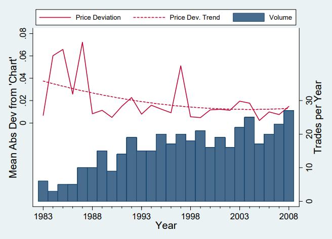
Variation in and volume of pick-for-pick trades, 1983-2008 (from The Loser’s Curse - Electronic Appendix)
By looking at past trades, we can see exactly which chart has become the standard. This was one of the main purposes of The Loser's Curse and has been repeated in recent years by analyst Rich Hill. Both of these average out former trades and put them on a curve so we can see what the NFL is valuing over a certain period of time. This is actually where The Chart originated, with its pick valuations being loosely based on trades from the late 1980s. We can compare these charts to each other and modern, performance-focused charts to get an idea of what the modern NFL draft value chart looks like.
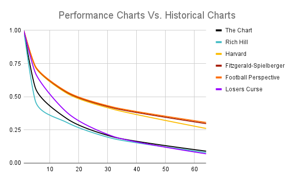
Comparison of various draft chart values in the first two rounds (data from DraftTek, Harvard Sports Analysis, OverTheCap, Football Perspective, and The Loser’s Curse)
When we plot them, we find two main groups. One is the performance charts. These are based on approximate value accumulated (Harvard), approximate value over an arbitrary "replacement" value (Football Perspective), and the compensation of second contracts (Fitzgerald-Spielberger). Then, we get charts based on former trades from 1987-1990 (The Chart, roughly), 1983-2008 (The Loser's Curse), and 2012-2016 (Rich Hill). I'll call these the historical charts. Based on this, we can see that modern trades rely not on player value, even without considering compensation, but rather an idea of value that only seems tied to what was arbitrarily decided in the past.
The Loser's Curse sums it up pretty well:
[T]eams have come to rely on The Chart to help them negotiate the terms of trade. The Chart was originally estimated by in 1991 by Mike McCoy, then a part-owner of the Dallas Cowboys... His goal was merely to characterize past trading behavior rather than to determine what the picks should be worth. The Chart then made its way through the league as personnel moved from the Cowboys to other teams, taking The Chart with them. In 2003 ESPN.com posted a graphical version of The Chart, reporting that it was representative of curves that teams use. McCoy’s original curve, as well as the ESPN curve, closely approximates the one we estimate for the 1983-2008 period.
What's truly concerning, though, is that Rich Hill's chart, the one based on the most modern data, is the steepest through the first round. The sample size isn't as convincing as that for the 25-year period used in The Loser's Curse, but even still it seems odd. Even if it's just a blip and modern trades match either The Chart or that found in The Loser's Curse, it's still an issue. Has draft valuation not advanced within league circles in thirty years? It sure doesn't seem like it.
Recently, the Panthers released an edited inside look at their draft and free agency process. It was very neat to get an inside look at what NFL teams are doing on draft night. One of the snippets involves the Vikings trying to move up from 14 to 8, presumably for quarterback Justin Fields. The Panthers' response was, "Don't call us with negative points." Of course, Carolina might have been trying to squeeze more out of Minnesota, but, even if they couldn't get one more seventh-rounder, the Panthers should have pulled the trigger.
According to the Jimmy Johnson chart and the going rate for picks, the Vikings' offer was poor. It had many fans laughing at them for even suggesting the deal and claiming it was a complete low-ball offer. However, modern charts would disagree. The Fitzgerald-Spielberger chart (which, again, uses actual NFL contracts instead of performance metrics) says the Panthers would have netted value equivalent to a late second-round pick. PFF's compensation-based chart claims the eighth and fourteenth picks are very similar in value for a non-QB, meaning Carolina could have added a third- and fourth-round selection for free.

Value of picks in a proposed Carolina-Minnesota trade, according to the Fitzgerald-Spielberger chart and The Chart (data via DraftTek and OverTheCap)
However, The Chart said otherwise. It claims that the Panthers would have lost a mid-second worth of value had they accepted the trade. This could and should have been a perfect win-win deal. The Vikings would get a top-five prospect at the most valuable position in football, while the Panthers would add on value by the pure circumstance of leverage. We ended up seeing this three picks later, when the Chicago Bears moved up, trading with the Giants to secure Justin Fields. The Bears were able to make the deal happen due to their willingness to give a future first-rounder in the deal.
It's confusing that a team hasn't seen this obvious opportunity to gain an easy advantage over their opponents. The reasons are likely psychological, but one day a team might overcome human nature and value the eleventh overall pick as they should. As wage scales change, so will these charts. The real question, though, is if the NFL will too.